
Image by a_roesler from Pixabay … cropped
Hello, my name is Seth and I’m a recovering perma-bear. (Hi Seth.) It’s true that I used to think that doom was inevitably just another quarter or two away. I was hyper-aware of the business cycle and the encroachment of government into the free markets. Thus, I concluded that growth would end soon. From an investment perspective I was simply wrong. It’s only now that I know that I lacked a robust process—a way of making sense of the investment landscape so that I could act profitably; that investing is mostly about managing losses; and that human ingenuity can overcome lots of adversity.
I’m better now, truly. Yet, I find myself terrorized by the current economic landscape in the U.S. It appears to be weakening. Due to my affliction predisposition, I am mindful of confirmation bias. Herein lies my conundrum. What’s a recovering bear to do at such a crossroad?
There’s only rightful action to take; look at the objective facts, stripped of opinion.
Below is a shortlist of interesting charts that, in my opinion, characterize the economic landscape. To be sure, there is an endless, complex list that one can examine. However, my purpose here is not to make a call on the economy, per se. Rather, it’s to fortify my process; to look for confirming and refuting evidence. This blog, after all, is like my therapy. Thus, I will keep things simple and look at five sets of data for both the bullish and bearish cases.

Some Bearish Facts
To me, there is no better economic signal than the yield curve. While there are plenty of pundits with plenty of reasons for why one should discount its bearish message, explaining away the data is precisely what I’m trying to avoid. The simple fact is that inversions (and subsequent steepenings) have strong correlations with forthcoming recessions (importantly, not causation). They don’t, however, time them well. The yield curve first inverted in March. This is nothing to ignore.
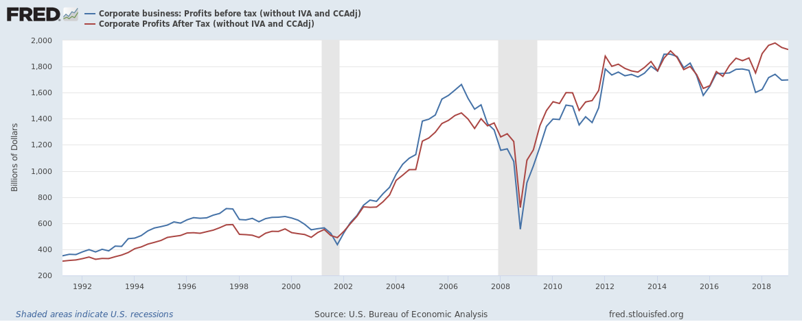
The economy is often touted as strong. However, the trend in corporate profits reveals otherwise. They actually peaked in the third quarter of 2014 and have been declining ever since. Note that last year’s tax cuts did in fact reverse the trend on an after tax basis (red line), but no benefit to pretax earnings (blue line) are evident. Since economic activity is strictly a function of production, corporate profits are the best measure, in my view, of the economy’s health. Note that this is different and more robust than the oft-cited S&P 500 earnings per share metrics
The trend in ISM’s manufacturing Purchasing Managers’ Index (PMI) is another negative item. It has a long history as a leading indicator of business cycles. We can see below that manufacturing PMIs have trended sharply lower for both the U.S. and elsewhere. This likely portends weakening conditions ahead.
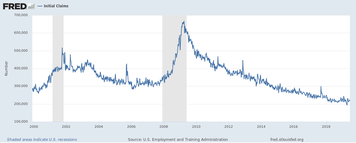
Employment trends are also cited as a strength of the economy. However, it is a lagging indicator. Initial jobless claims provide a more real-time snapshot. Here, we can observe two facts. The first is that initial claims are at extremely low levels. While this appears bullish, they might have recently bottomed. A reversal in trend—which is too early to call just yet—would be troublesome.
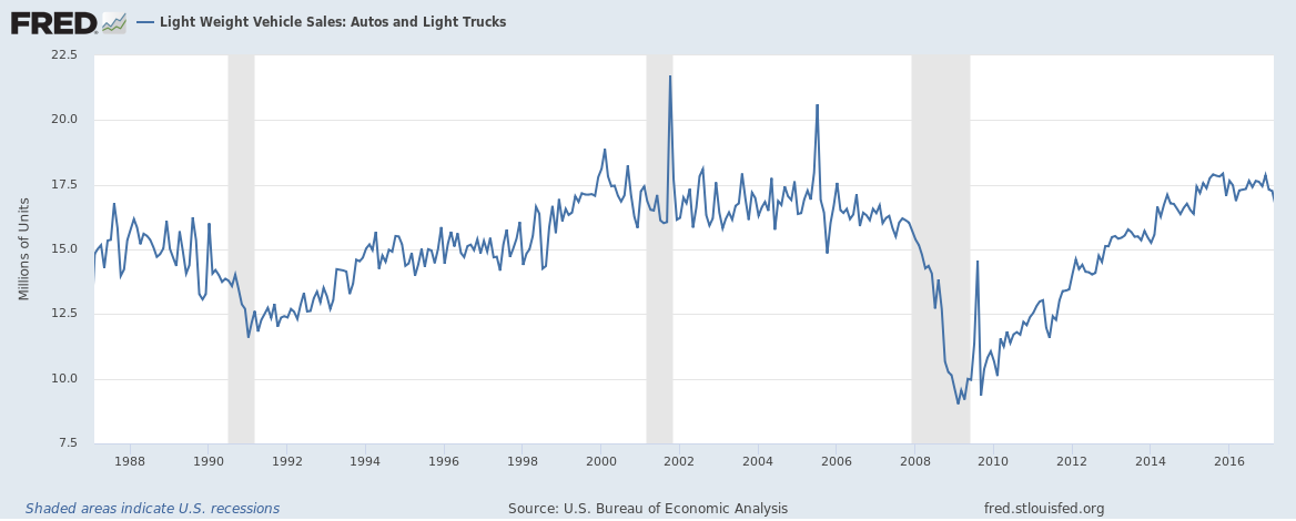
Purchases of big ticket items, such as cars, can also provide some economic insight. Declining auto sales are more data that paint a gloomy economic picture. Of note, they have plateaued for both new (the first chart below) and used cars (the second chart below). True, they are coming off high levels, and used car sales rebounded as of late (not shown); but declines are declines nonetheless.

Some Bullish Facts
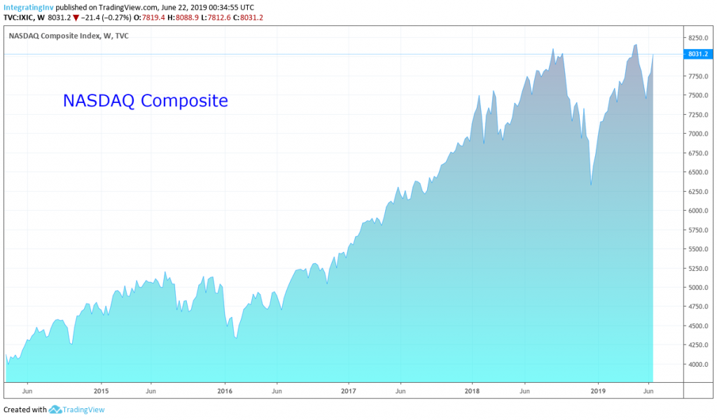
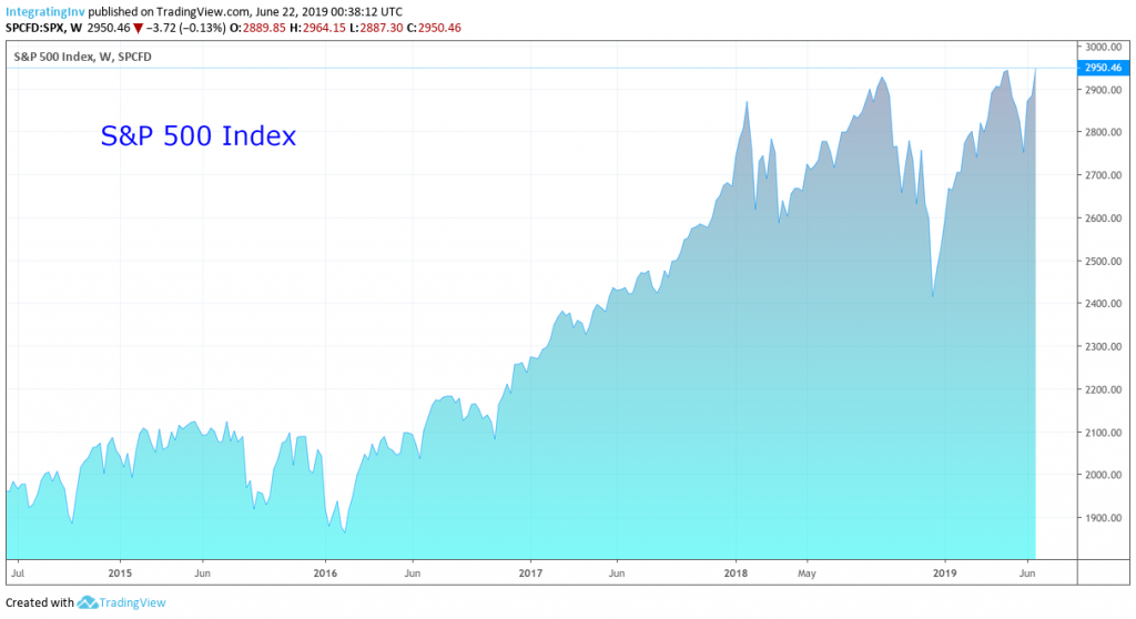
To be sure, not every data set is negative. Perhaps the most obvious, positive signal is the U.S. stock market. Equities are discounting mechanisms. If investors were truly worried that a change in corporate fortunes were upon us then this sentiment should be reflected in equity prices. Sitting near the at-time-highs suggests that investors are not concerned.
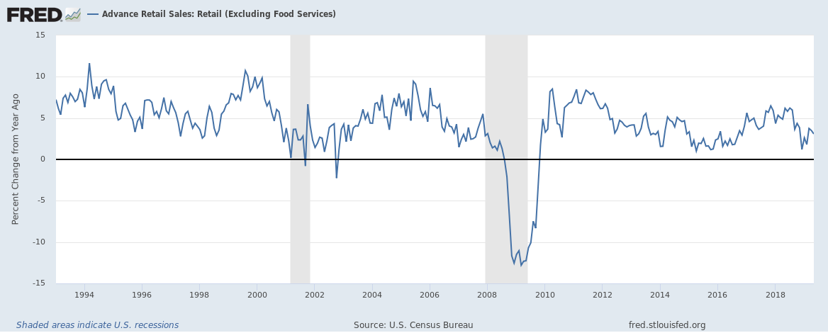
Retails sales are also strong. While no economy, including the U.S., is “consumer led” (I’m sorry, consumer spending makes up 70% of GDP which is only a proxy for economic output, not an actual measure of it), a drop in spending would logically follow a drop in economic production. Here too, we see continued year-over-year expansion of demand.
While manufacturing PMIs are trending lower and flirting with contractionary levels, ISM’s U.S. service sector PMI points to continued growth. This tempers the former’s negative read since the service sector is the larger of the two.
ISM’s Non Manufacturing PMI indicates future growth is likely.
source: tradingeconomics.com
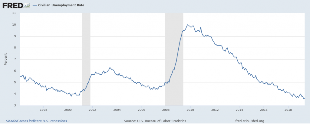
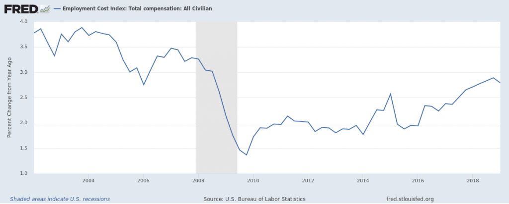
As noted above, employment trends are still positive. Unemployment remains low and has yet to bottom. Furthermore, worker compensation is on the rise. These also suggest that economic conditions remain favorable.
However, the most bullish signal to me is that being bearish is commonplace. Growth scares tend to catch people by surprise. Thus, today’s setup does not seem conducive to producing the kind of negative shock that leads to market selloffs. As shown below, most investors are already defensively positioned.
Looking Both Ways
So there you have it, a bunch of facts about the economy and markets. While I come out bearish, the purpose of this is article is not to convince you of my position. Rather it’s to present some commonplace data in order to overwhelm my own inherent biases.
Does a weakening economy mean recession? Hardly so. However, if one mentally models economies and markets as carry trades (as I explain here and more thoroughly in this report beginning on page 7) it becomes evident why even slowing of growth matters. But even if a recession were obvious and evident, we investors care about asset prices, not recessions as such. Thus, profitable trading might entail positioning in counterintuitive ways.
The first step to recovery is admitting that you have a problem. I suffered from a major case of perma-bear-itis. Building a process is just the second rehabilitating step. Progress comes piecemeal. Thus, this recovering perma-bear intends to thoroughly look both ways before venturing out across the investment crossroads.
If you enjoyed this article please consider sharing it with others.
since you are a high yield guy, what do you think of the whole GE fraud? normally i would dismiss it but it’s coming from harry markopolis and that’s not a dude one wants to ignore- he does his due diligence very thoroughly. with that said, i just didn’t like how his compensation is tied to a third party/HF in the disclaimer before one can download the 175 page fraud report. i am worried if this is true then it could set off a domino effect in the BBB space and coupled with weak markets and reflexivity then it could be a game changer. the potential downgrade of BBB’s which i currently watch are: GE, GM, F, T and DELL which comprise of about $750 billion in the investment grade space with a potential to be downgraded to junk status. if any of these get downgraded then i am afraid it could set off a chain reaction to other parts of the market.
trying to see where i am wrong as i have a case of bear-itis myself so would love to hear your thoughts as you are a high yield guy so i reckon you are way more in tune than myself.
thanks seth
So I’m going to be careful how I answer your question. I keep this blog separate from my professional activities and I don’t want to create any conflicts (actual or perceived). I haven’t gone through the specifics of the GE fraud report, but I have seen one credible person discredit it (John Hempton), so there’s reason to be skeptical. WRT to the downgrade risk of any of these large BBB credits, it’s real. They would be difficult to absorb by the hy market, and could cause spreads to widen … that’s if people had to sell. One counter to the bear case is this: I never underestimate regulators’ abilities to grant relief to their constituents. If regs were changed such that pensions, insurance companies, banks, etc. weren’t forced to sell upon downgrade then this pressure could be (partially) alleviated. In the GFC mtm accounting guidelines were changed to accommodate companies, so it’s worth keeping an open mind. Also, I suspect that the rating agencies’ responses will lag the market’s. Just look at Moody’s handling of F (they’re flip flopping). It’s a great question and something worth monitoring. Given the historically high amounts of corporate debt, I think it’s worth monitoring spreads as an indicator of broader, market/economic health. Thanks for the question.
The process described includes a long series of graphs, only one of which is not a time series. My experience has been that graphs relating variables to each other, and not simply tracking them over time, can result in higher-quality insights.
Thanks for your thoughts. You may very well be right. The process I am proposing is to consider data for both sides of an argument, whatever the best data sets may be (time series, cross-sectional, etc.)